Improving Expense Splitting with Receipt Scanning and Enhanced Uneven Share Flow for the Dodota Application

● UX/UI Design case study

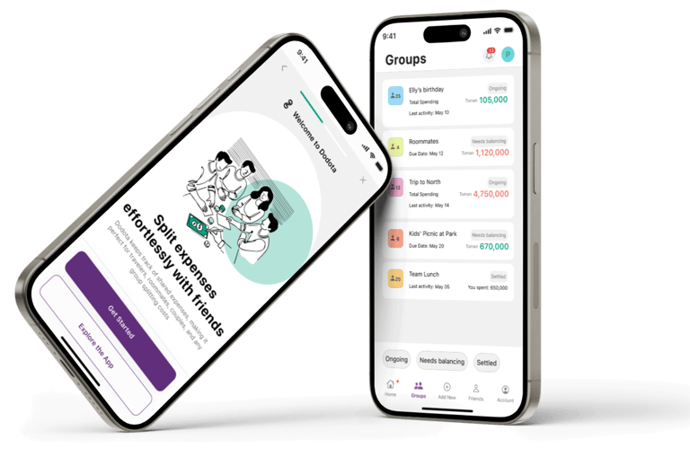
Dodota is a seamless app designed to make managing shared expenses effortless and enjoyable.
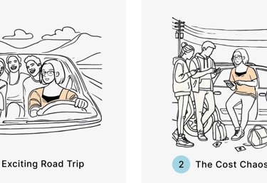
Whether it's splitting bills with friends, managing household expenses, or tracking costs on a group trip, Dodota ensures seamless financial collaboration.

A split Bill Application

● What is Dodota?

what was the main problem?
The solution

A Simple Scan, A Stress-Free Trip.

The problem

Group outings are fun until it’s time to split the bills!

and the best solution

● Project overview

Trips Are for Memories, Not Math!

After launching our MVP, we tested it with a small group of users on real trips. While they liked the concept, it became clear that manual entry was too slow and confusing. They needed a faster, more accurate way to handle shared expenses — especially when traveling in groups.

As the designer, I knew we had to rethink the experience to make it faster, clearer, and fair for everyone.

I followed the Double Diamond framework to guide the redesign — from uncovering pain points after MVP testing to delivering a new feature that aligned with real group travel needs.

11 Steps That Brought This Feature to Life

● Design process

Smarter Scanning, Fairer Splits, Less Manual Work

During the discovery phase, I analyzed three competitors to understand how they approached receipt scanning and expense splitting. This helped identify common pain points and gaps — like limited flexibility in uneven splits or clunky scan flows.

I also studied intuitive apps like Airbnb and Telegram to explore how they reduce friction in complex tasks. These insights guided our understanding of user expectations and informed early design directions

● Step 01: Competitive analysis

Next, I interviewed five target users (three experienced with similar apps) to understand their pain points and preferences around receipt scanning and bill splitting during group travel.

When 4 out of 5 users worried about accuracy, I designed for trust.

● Step 02: Interviews

After the interview stage, I used an affinity diagram to analyze the data and categorize the findings, which provided a clearer understanding of user priorities.

Prioritizing Error Prevention, Scanning Accuracy, and Data Entry Experience

● Step 03: Affinity diagram

User Needs Prioritization

● Step 04: Persona

Emma: The Group Trip Organizer Who Wants Speed, Clarity, and Control

Based on my research and user priorities, Emma values efficiency and simplicity in managing expenses, seeks easy solutions for organizing and splitting costs, and prefers to avoid complex calculations.

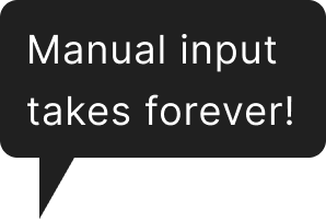
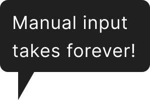
Understanding Emma's frustrations with inaccurate scans, manual errors, and disorganized expenses, I designed solutions focused on precision, transparency, and ease of use. Each feature directly addresses her need for quick, accurate, and hassle-free expense sharing

Tackling Accuracy, Transparency, and Seamless Expense Management.

● Step 05: Challenges and Solutions

  • About Scan accuracy

  • About Input Entry Accuracy

  • About Expense Management

Based on research, I sketched my ideas and identified the most suitable options to move forward. To quickly explore these concepts, gather feedback, and improve collaboration with the design and business teams, I created initial draft sketches with minimal details, focusing on the overall flow. Here are some of my preliminary hand-drawn and digital sketches.

Early Sketches to Shape the User Flow

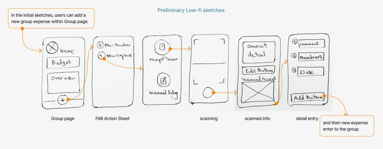
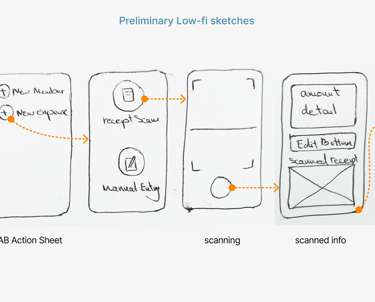
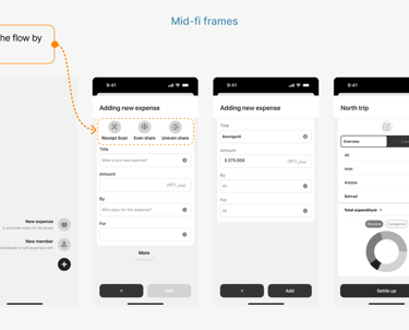
As the second stage of the develop phase, I designed a task flow to visually outline the high-level screen transitions before moving on to wireframing. This task flow systematically mapped out and organized all potential solutions, ensuring a cohesive user experience.

User Journey: Adding a new expense via receipt scan & uneven split

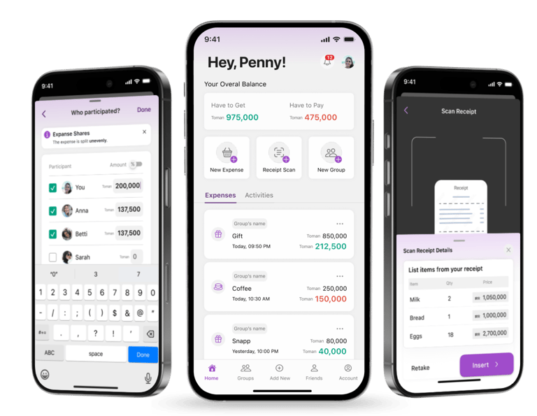
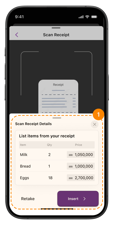
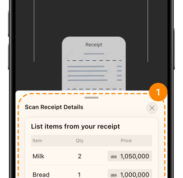
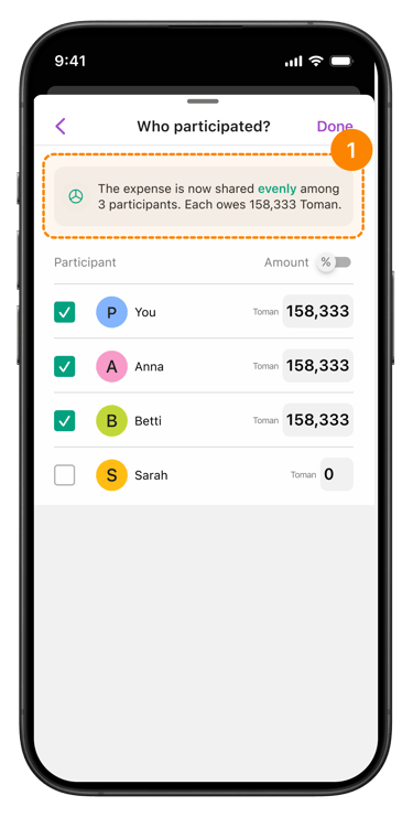
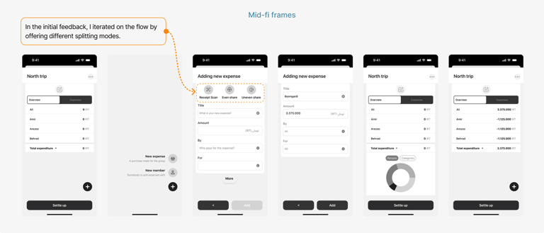
This was one of the most iterated screens, introducing a core feature for adding expenses. I refined the UX to boost clarity and discoverability, then translated the final version into high-fidelity wireframes and a clickable prototype for validation.

Enhanced Receipt Scanning 3x Discoverability, Zero Confusion

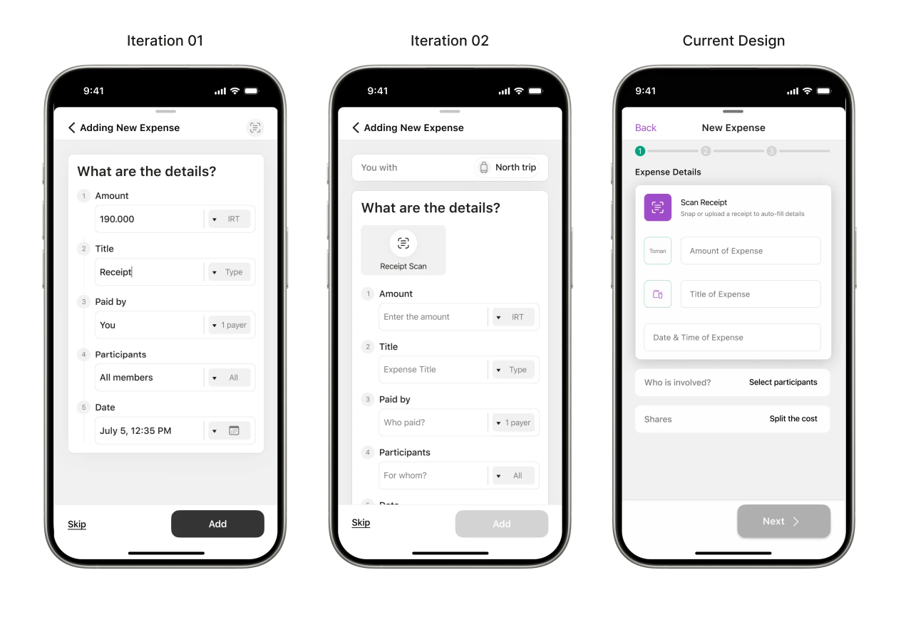
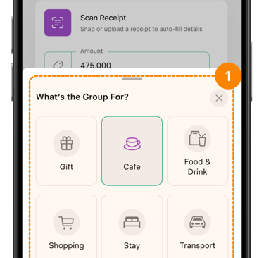
Iteration 1 : Scan icon was overlooked by users.

My Solution: To address this issue, I applied the following UX laws:​
  • Von Restorff Effect: Made the icon stand out with a clearer label and strategic placement.

  • Cognitive Load: Reduced effort by aligning icon placement with user expectations.

  • Accessibility: Used high-contrast accent color for better visibility (WCAG-compliant).

Enhanced receipt scanning

Iteration 2 : An extra choice between 'Capture' and 'Library' disrupted the scanning flow.

My Solution: I reduced friction by applying key UX laws:

  • Hick’s Law (Fewer choices = faster decisions): Opening the camera by default avoids decision fatigue.

  • Jakob’s Law ( Follow familiar patterns): Most apps launch the camera instantly — so should this one.

  • Cognitive Load: Defaulting to the common action (taking a photo) keeps users in flow, with a subtle icon for alternatives.

Iteration 3 : Users couldn’t scan multiple receipts in one flow, breaking momentum and adding friction.

My Solution: I applied the Peak-End Rule to keep the flow smooth and end on a positive note.
Allowing multi-scan avoids interruptions and leaves users with a better overall experience.

Iteration 4 : Two unlabeled “Add” buttons caused confusion and hesitation.

My Solution:

  • Applied UX writing

  • Law of Common Region: Grouped buttons looked alike, so users misclicked — slowing them down.

Iteration 5: Users struggled with uneven splits — the layout lacked clarity.
Confusion around:

  • Who’s included in the split

  • What each person owes

  • Whether inputs were amounts or percentages
    These led to frequent mistakes, backtracking, and disappointing.

My Solution: To address this issue, I applied the following UX laws and insights:

  • Jacob’s Law: Used familiar HIG-style checkmark tables to align with user expectations.

  • Hick’s Law: Added a simple toggle between “Amount” and “Percentage” to reduce decision time.

  • User Research Insight: Set “Amount” as the default input, based on user preference — with flexibility to switch.

  • Miller’s Law: Included clear labels and inline guidance to reduce memory load during complex tasks.

  • Progressive Disclosure: Moved detailed explanations into a styled alert for helpful context without clutter.

Share split Frame

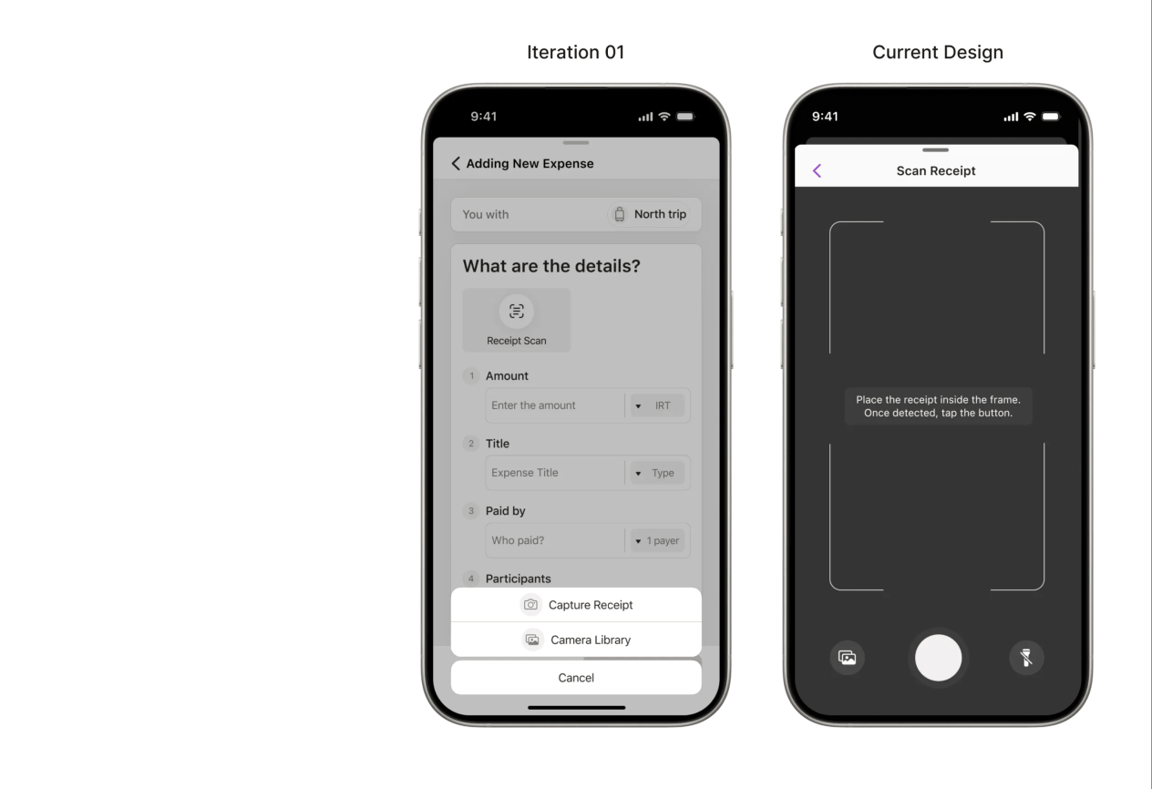
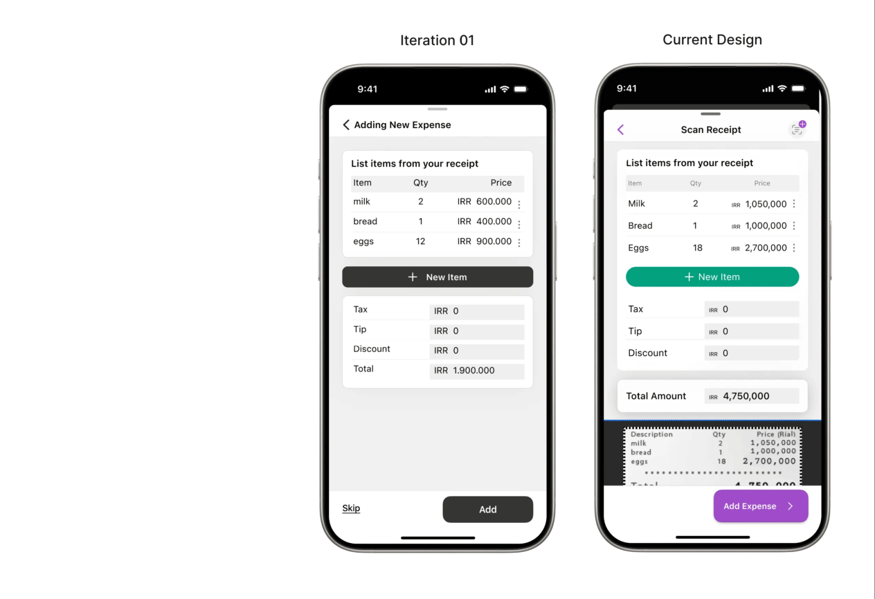
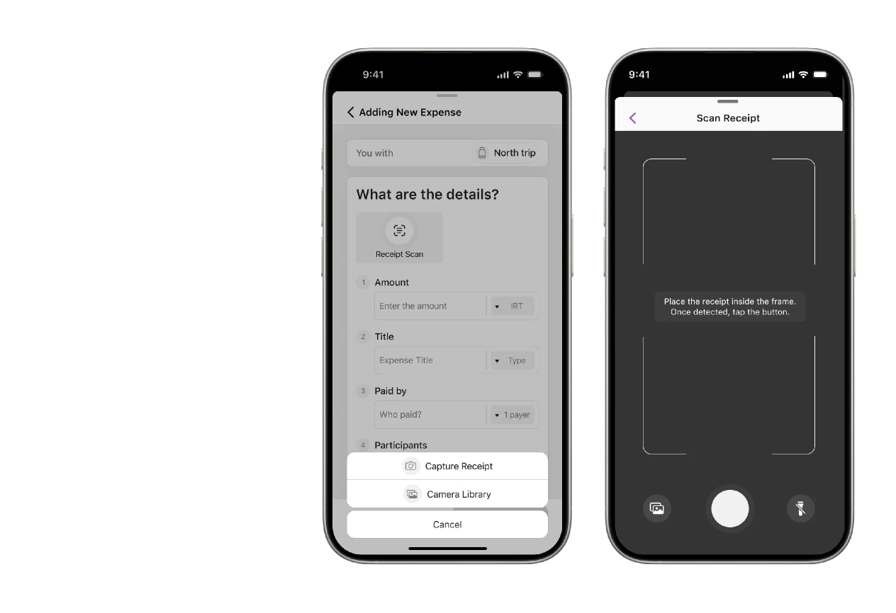
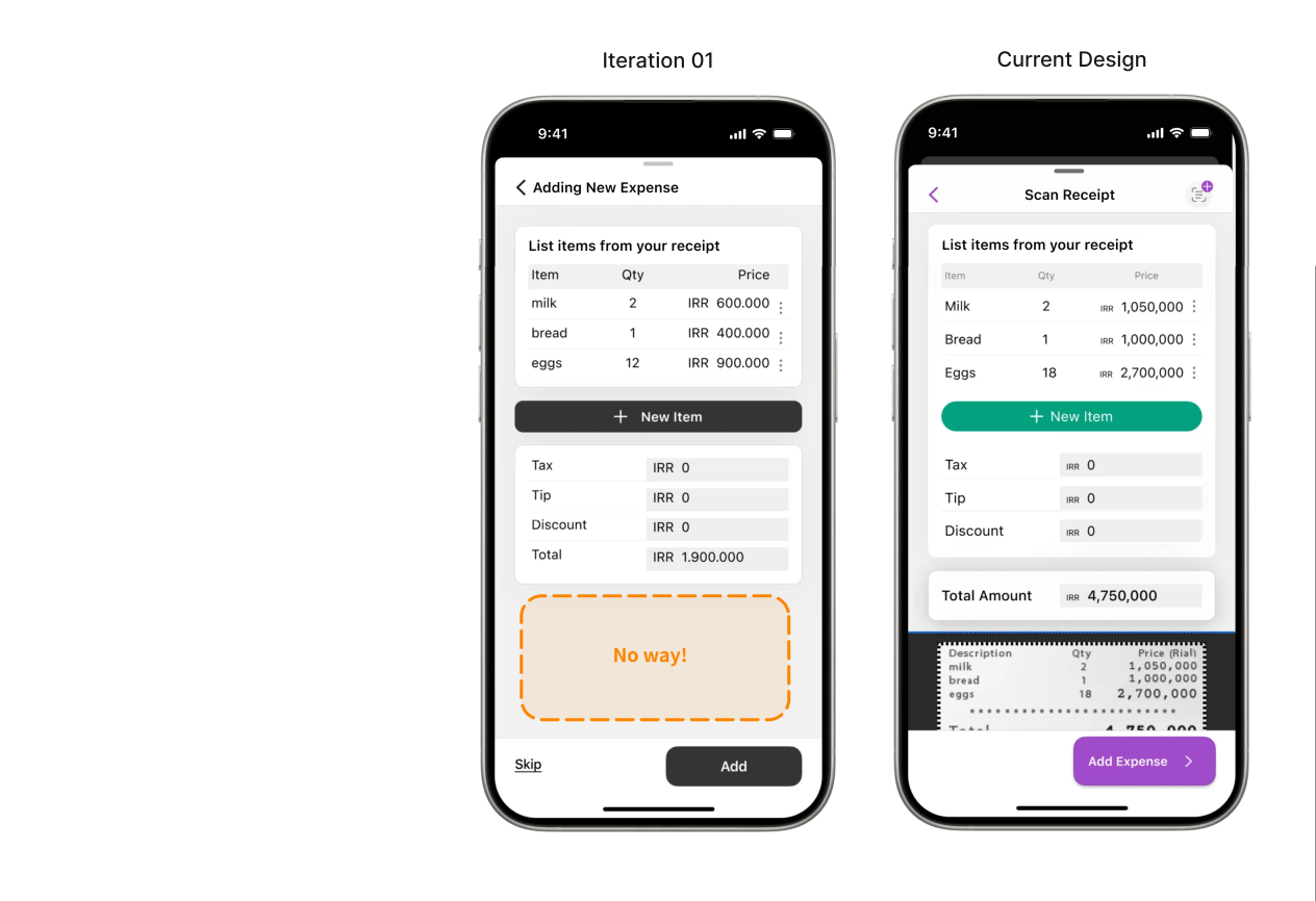
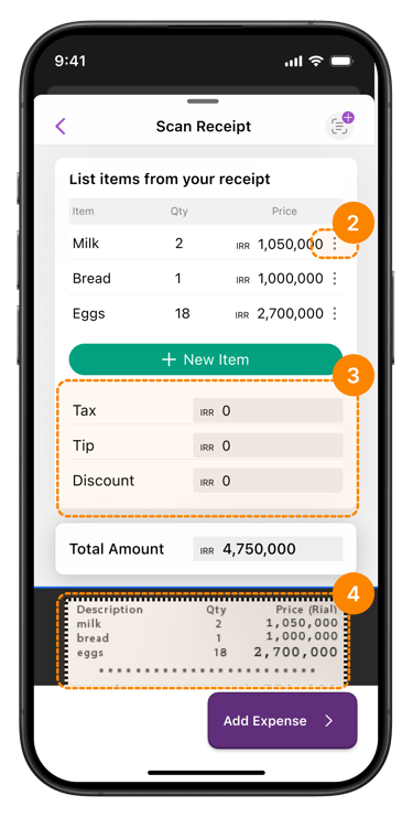
UI enhancements included:
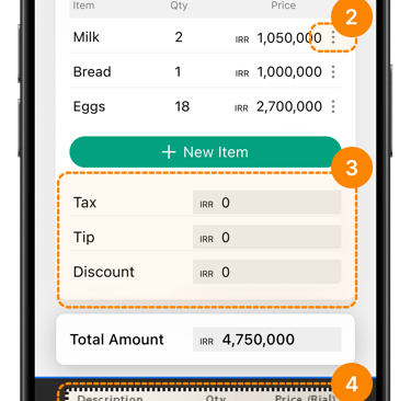
• A standout scan receipt button using the core accent color
• A new editable table for amount & percentage input
• Clean modals for focused interactions
• Refined navigation for better usability
• Polished expense cards for visual consistency

All updates aligned with the design system, boosting clarity and user flow.

Extended Existing Design System

At this stage, I defined this as the final prototype for the task flow, fully documented and prepared for developer handoff. While it marks the end of the design phase for this feature, I recognize that great design is iterative — evolving continuously with user behavior, feedback, and emerging needs.

A polished design, ready for handoff “ but never final in spirit”