Designing Fixy Dashboard
● UX/UI Design case study
See how I turned fragmented service requests into a seamless, trackable experience and keeping users informed and in charge of their home projects.


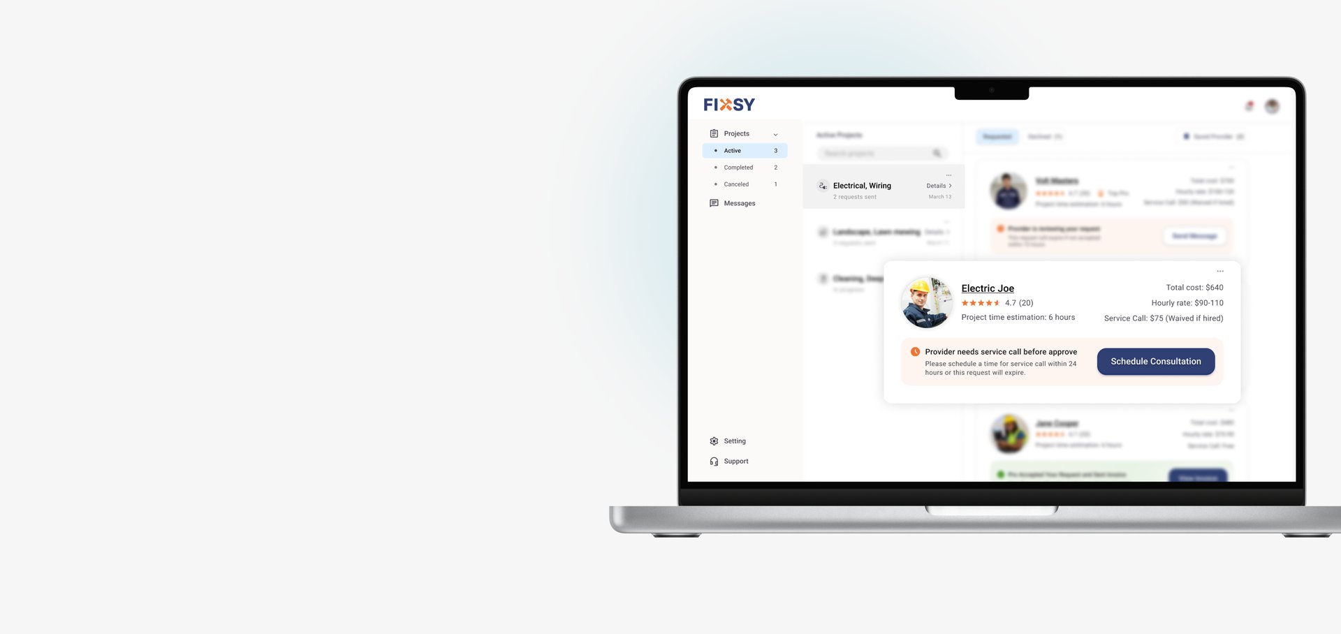
Design a dashboard that simplifies complex request flows, clearly communicates request limits and statuses, and helps users manage ongoing or declined requests with confidence.
How might I...
● Design Goals
In early discovery sessions, we met with business stakeholders to define product priorities: clear visibility into request states, simple request management, timely user actions, and balanced self-service. Business also expected a high level of dashboard clarity to minimize support needs. These inputs shaped our core design goals
Understanding business priorities to define core design goals
● Stakeholder Discovery Meetings
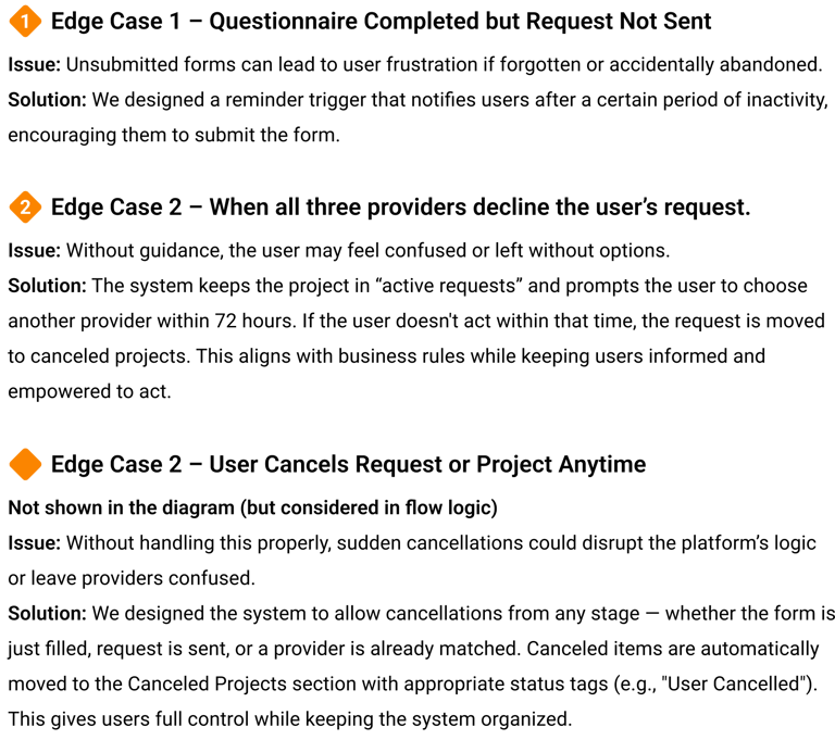
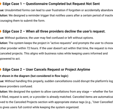
Following business requests around limiting active requests and keeping canceled requests visible, we ran team sessions to explore possible user scenarios. We simulated different cases to evaluate how to best present these limits, guide user actions, and organize declined or canceled requests without overwhelming users.
● Team Discussions
Designing for the Unexpected
● Competitive analysis
Insights for layout structure,
provider cards, and end-to-end flows
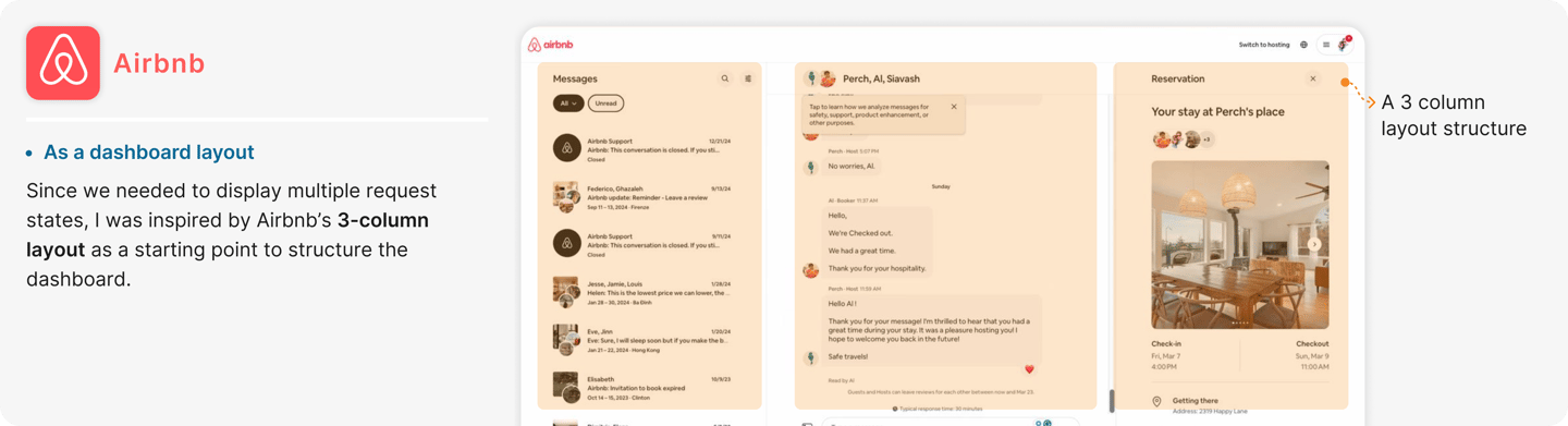
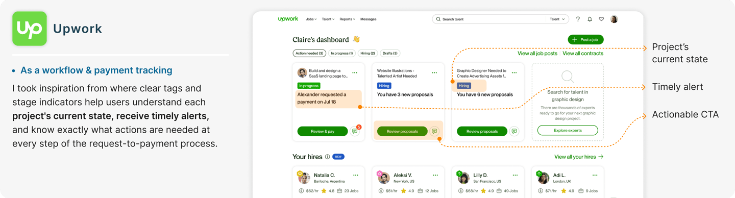
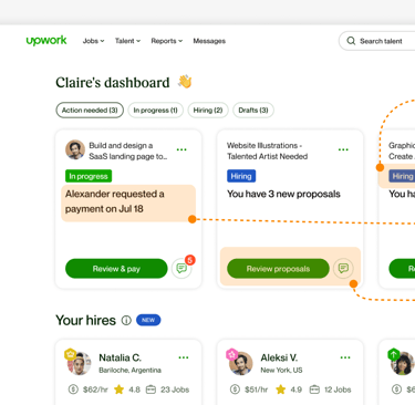
After identifying key business needs and edge cases, we analyzed how competitors approached similar challenges. I started with direct competitors like Thumbtack for card-based request management. To address gaps in full project tracking, I drew on Airbnb’s state clarity and Upwork’s end-to-end request-to-payment flows — shaping a dashboard structure that supports users across the entire service journey
● Information Architecture
Structuring the Dashboard
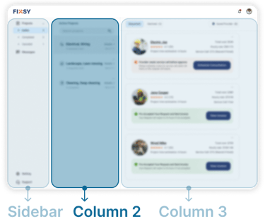
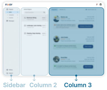
Through stakeholder input, competitive analysis, and scenario exploration, we defined:
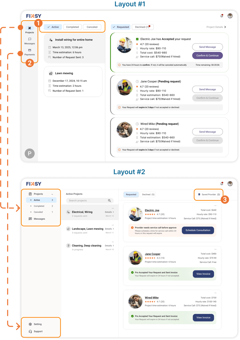
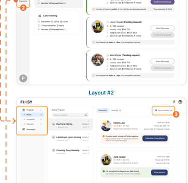
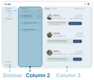
The initial 3-column dashboard structure. To refine information grouping, we ran two card sorting studies:
One focused on sidebar navigation categories,
And one targeting request states in the third column. These studies revealed intuitive groupings that improved navigation clarity and directly informed card structure and labeling.


● Navigation and site map
Visualize the whole hierarchy of content
I created a sitemap to visualize the content hierarchy and navigation structure. This helped align the design and development teams on page relationships and ensured clarity before moving into prototyping.
● User Flow
Visualize the whole hierarchy of content
After defining the content structure, I mapped user flows to illustrate how requests move across different states. Special focus was placed on handling declined, expired, or inactive requests to ensure users stay informed and empowered to act — whether that’s messaging providers, scheduling consultations, or submitting new requests — reducing friction and maintaining service momentum.
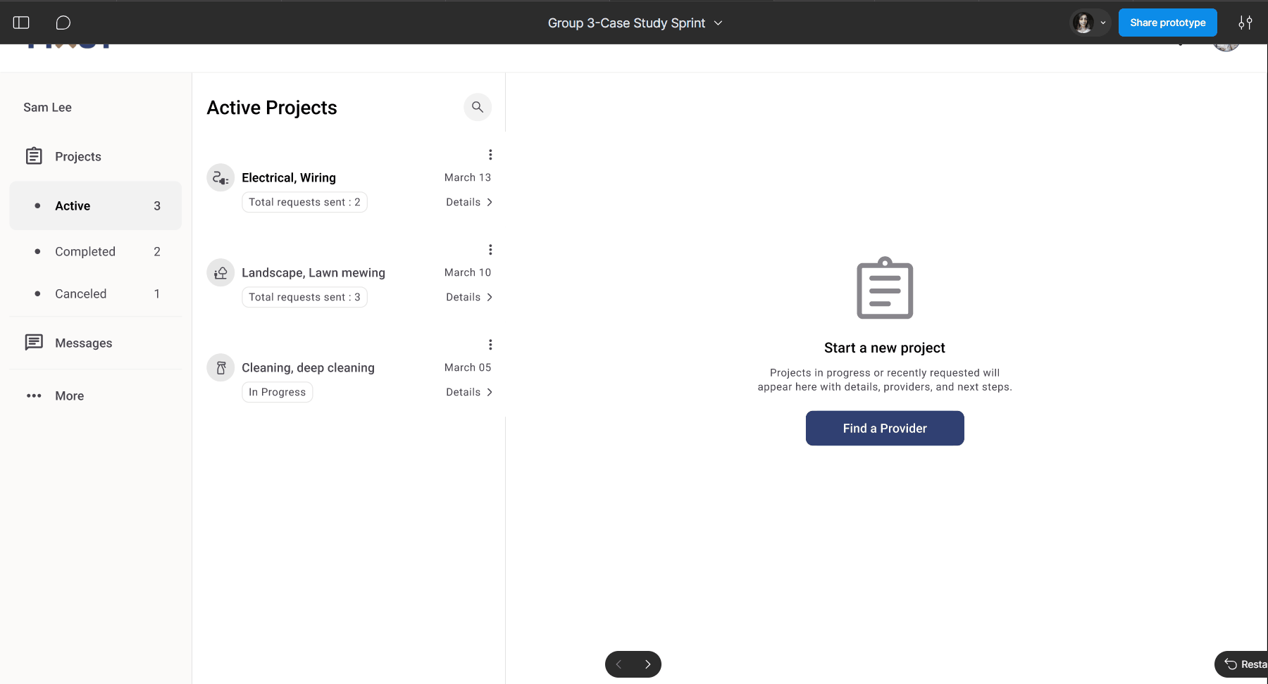
Fixsy Active projects User Flow

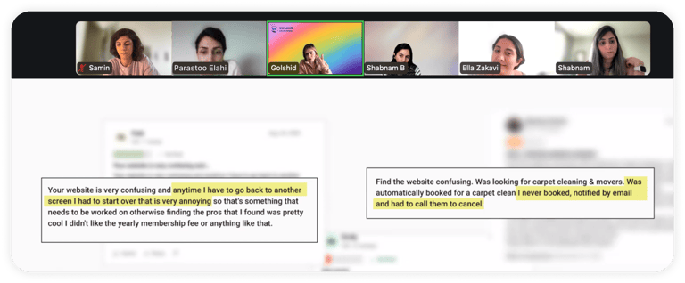
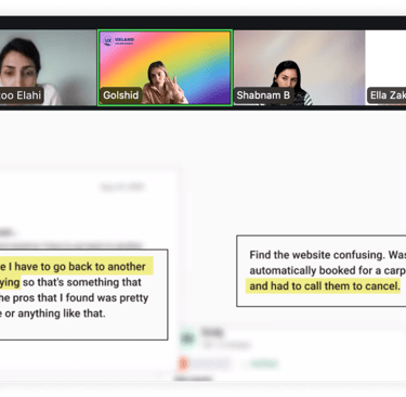
● User Testing
Validating Layout and Content with Real Users
After testing individual components step by step, I conducted overall design validation to ensure the dashboard supported fast comprehension, confident decision-making, and clear visibility across multiple request states.

Dashboard Navigation iterations

Column Two Iterations
Column Three Iterations


3. Team & stakeholder discussions
Understanding business priorities to define core design goals
Discussions within our team and with stakeholders helped surface critical edge cases, especially around cancellation flows, limited active requests, and user confusion when managing multiple request states.I used this input to simulate realistic scenarios and refine our design logic.
● Proposed solution
An intuitive, state-aware dashboard for Fixsy that increased task clarity by 83% and boosted completion by 67%—designed to give users control and build long-term trust.


● Project outcomes
Delivering meaningful improvements in user behavior and satisfaction through a redesigned dashboard experience.
Next steps
Delivering meaningful improvements in user behavior and satisfaction through a redesigned dashboard experience.

